Thursday, September 6, 2012

Aspect Ratio

All things being equal, the epub format is preferable to pdf for reading on devices like the iPad, Nook, Sony, Kobo, and other dedicated e-readers.
But for some types of books (such as manga, comics, or graphic novels), epub doesn’t seem to be able to handle large images that should fill the screen.
Apple has gone so far as to create its own fixed layout format for such ebooks.
It is possible, though, to stick with epub and get perfect results for illustrated ebooks, using the forgotten (or perhaps simply overlooked) svg image element.
Here’s a peek under the hood of how we do it at eBookBurn.com, as part of our new illustrated ebook publishing feature.
This is an example of the markup to use in your epub’s xhtml files for each image:

<svg version="1.1" xmlns="http://www.w3.org/2000/svg" xmlns:xlink="http://www.w3.org/1999/xlink" width="100%" height="100%" viewBox="0 0 592 900" preserveAspectRatio="xMidYMid meet">
<image width="592" height="900" xlink:href="images/page01.jpeg" />
</svg>
What this markup does is take a JPEG image sized 592 pixels wide by 900 pixels tall, and frame it in the center of a 592×900 svg element.
It turns out that 592×900 is the right size and aspect ratio for “standard-sized” six inch e-ink screens found on the regular Nook, and Sony Reader.
So why use svg at all?
Wouldn’t it be simpler to define it with the plain img tag (as this epub template does), like this?

<img src="images/page01.jpeg" width="592" height="900" alt="Page 1"/>
Unfortunately, many devices, such as the iPad and the Nook Color, have screens larger than six inches.
So on those devices, using the plain img tag in your epub’s xhtml files leaves an embarrassing whitespace gap, from where the image stops to where the actual screen ends.
The svg element shown earlier, though, is different: it stretches the image to fill the entire screen, while preserving the aspect ratio.
It’s also important to note that 592 width and 900 height specified within the svg and image elements should not be thought of as pixel sizes, since no units are defined, but as a width-to-height ratio.
So any image with the same aspect ratio as 592×900 will work well, regardless of its actual size. Scaling up to larger screens, though, also means the dpi count should be reasonably high, at least 72 dpi (and more for images whose base size is smaller than 592×900 pixels).
For most devices, that’s enough, but some e-readers insist on adding margins and other padding to each page, so it’s helpful to define this in the xhtml file’s head block:

<style type="text/css">
@page { margin: 0.000000pt; padding: 0.000000pt; }
</style>
And these css classes in the stylesheet:

.svg_outer {
display: block;
margin-bottom: 0;
margin-left: 0;
margin-right: 0;
margin-top: 0;
padding-bottom: 0;
padding-left: 0;
padding-right: 0;
padding-top: 0;
text-align: left;
}

.svg_inner {
display: block;
text-align: center;
}
So the final xhtml for each page image looks like this:

<div class="svg_outer">
<div class="svg_inner">
<svg version="1.1" xmlns="http://www.w3.org/2000/svg" xmlns:xlink="http://www.w3.org/1999/xlink" width="100%" height="100%" viewBox="0 0 592 900" preserveAspectRatio="xMidYMid meet">
<image width="592" height="900" xlink:href="images/page01.jpeg" />
</svg>
</div>
</div>
Just repeat that pattern for every image in book, for every chapter that contains full-page illustrations.

Home / Section: Animation Yves Bigerel creates set of comic demonstrations using Flash

http://dailycartoonist.com/index.php/2009/02/21/yves-bigerel-creates-set-of-comic-demonstrations-using-flash/

http://balak01.deviantart.com/art/ABOUt-about-DIGITAL-COMICS-112523191

Yves Bigerel (known as Balak01 on DeviantArt) has created a set of demonstrations showing how print comics can be translated onto the web while maintaining their essential quality — the sequential use of space to tell stories through time — using Flash.
While some alternate methods used by others have included adding motion and sound to single or multiple panels, his simple demonstrations have shown that keeping the narrtive flow of one panel after the other is all it really takes to tell the story, keep attention, and attract a growing audience .
The first is “About DIGITAL COMICS”, the second is “ABOUT about DIGITAL COMICS”.
At the time this article was written, the first of the displays has been up for two weeks, has gained over 50,000 visits, and the attention of established comic artists.


Thursday, August 23, 2012

Interaction is More than Looking at Screens

Homework Article:
http://www.howinteractivedesign.com/designing/future-of-interaction-design


Back in the ’90s, forward-thinking designers started playing with HTML. The ones who did might’ve had a sense that the web was going to be a big deal, but it wasn’t a prerequisite for experimenting with design and code. It wasn’t long before the web’s big-dealishness was obvious, and the mood shifted. The web was no longer about experimentation; it was about work. For many designers who began their careers in print, the web was what they did now. Since then, the big conversation has been about making the print-to-web transition. And we’re still having that conversation.
But just like in the ’90s, there is something happening on the fringes today that forward-thinking designers are experimenting with. And if we’re not paying attention, today’s interactive designers could get left behind just like the print designers did 15 years ago.

More Resources

We need to start shifting the conversation from “print to web” to something more nuanced and much deeper. It begins with expanding our definition of “interactive” to push beyond work made for the screen. After all, the interactions typical to screen interfaces are hand-guided visual experiences. Until very recently, that meant bridging the gap between our bodies and the screen with a keyboard and a mouse. Even with fancy touchscreens, the glass surfaces offer virtually no tactile experience to our extraordinarily sensitive fingertips.
(And if you want to debate that point, close your eyes and touch the screen of your mobile device of choice. Try to use it. Now compare that to digging into your pocket and feeling the difference between a nickle, dime or quarter. Amazing what our fingers can do, provided they’re given some information to work with, eh?)
We’ve grown accustomed to associating “information” with bits, which is a phenomenal thing in and of itself. But there remains a world of information embedded in physical objects and in the interactions we have with them. Connecting the unseen world of information—the virtual world made manifest on the internet—with the tactile world around us is the next stage of design. We’ve been playing with visualizing this in the form of augmented reality (AR), but that’s going nowhere. AR is unhelpful because we already know that information is all around us. Seeing it on a screen only creates more work for us, forcing us to interpret visual signals on top of everything else, when that’s what technology should be doing for us. Last September I put the dis on AR in my Interaction column in PRINT and called for a focus on “awareness technology.” I said (and yes, I realize it’s questionable to quote yourself):
…if a machine can collect information and deliver it to our eyes, it should also be able to save us the trouble of analyzing and interpreting that data. “Awareness technology” should be doing much more for us than making advertising more ubiquitous. It should be helping us to do more work, more efficiently and more effectively. Rather than trying to enhance how we see reality, we should instead consider augmenting reality for machines. A more aware machine is far more valuable to us than a more crowded visual field.
The good news is that we’re making amazing progress with awareness technology—and it’s not all dystopic surveillance and Skynet. Much of it has been based upon the use of radio-frequency identification, or RFID, a technology that can be minuscule and embedded into objects so software can “see” where those objects are and “feel” how they’re being used. This kind of monitoring and analysis could help us design better systems of all kinds—from “smart” buildings to more efficient roads, transit systems, electrical grids, and much more. The possibilities are very exciting.
But it’s not about building a techno-utopia. For me, a world with more machines is not necessarily a better world. The reality is the problems we face—the crumbling infrastructure, a dwindling supply of natural resources, pollution—have outscaled our cognitive capacity. We’re smart enough to recognize them, and even to propose legitimate solutions to some of them. But we’re not fast enough to get to them all before the damage is too great, and we’re not able to see how they’re interconnected to avoid proposing a solution that might nip one issue in the bud but make another worse. There’s an urgency here that’s just as significant a motivator as exploring a new technology. So, if there’s any hope of a world with a healthy balance of the natural and the technological, we’re going to need to increase the ubiquity of the machine in the short-term. Sure, it’s daunting, but what could be more inspiring than working for a better world? (For more on this, see this piece I did for Print.)
This is the stuff of interactive design. More than websites. More than mobile apps. More than games. More than screens. Remember that scene at the end of The Matrix, when Neo finally sees the matrix for what it is, not the moody ’90s noir world but the undulating rows of code? As soon as the illusion disappeared, the first thing he did was take control and push beyond the code. Hokey? Sure. But what’s inspiring about that metaphor is that while the virtual world is an endless venue for exploring ourselves, it also creates a feedback loop right back to the real world. That’s interaction, and that’s the future of design.
When Grace and I chatted about this topic, she thought a great prompt would be “Why designers and hackers should be friends.” I think this gets at it, but I want to push it. It could just as easily be why designers should be hackers. Or scientists. Or city planners. Or sociologists. You get the point. As the world becomes more and more complex, so does what it means to be a designer.


 My Commentary                                                                                        
"AR is unhelpful because we already know that information is all around us. Seeing it on a screen only creates more work for us, forcing us to interpret visual signals on top of everything else, when that’s what technology should be doing for us"
I hate augmented reality. I'm not a big fan of most 3d graphics. Seeing something on screen doesn't make it more cool. There are only a couple instances of useful AR that come to mind. At the Lego store you can hold up the box and rotate it around to see different angles of the finished product. And, the video that TED video that showed a video about how to set up a wireless router using, Aurasma.

Other then the AR I don't understand what this guy is talking about.  Smarter machines or something. I don't get it.

Thursday, August 16, 2012

Questions for Q

Monetization
  itunes like store

Layout
   Fixed
   Responsive
   Book-like?

Interaction
   Comments
    Discussion

http://www.youtube.com/watch?feature=player_embedded&v=ac2sGuE3kEw


using shopify
comicsology dumb
a system to cloud then swap out
wrap it in a app with phone gap
or like wormworld through applestore download free and pings when theres a new episode
no drm

mignola art looks good on ereader

craig mod talk
i love typography posted a video on him craig
some content requires fixed layout, but usually designing the grid that is responsive
no forcing the reader to choose a certain font

wormworld doesnt do anything fancy but uses the strenghth of a browser and touch technolgy
using the strengths of the medium that you cant do in print

yzes bigerel
flash thingys
marvel highers
you are in coltrol of moving left and right
character moves through the panel

Self publishing an illustrated E book

 My Commentary                                                                                       
According to Holly Brady an E book publisher, if your considering publishing or republishing an illustrated book, like a cookbook, a children's book or a graphic novel you need to present such books in a fixed layout format. A fixed layout unlike an adaptive or liquid layout will not make dynamic changes for different mobile devices or mobile device orientations. Holly's points out that adaptive layouts tend to impede ones ability to read illustrated content in which the layout is part of the reading experience.

Assuming that Holly's point is valid how does one go about publishing an illustrated ebook with a fixed layout? According to Holly "There aren’t yet many vendors who know how to take a print book and turn it into an enhanced ebook for the iPad." She recommended two companies which translate books formatted for print into electronic publications: YUDU, and Innodata. I downloaded one of the books reformatted by Holly through YUDA and was not that impressed with the result. In addition since I already have a lot of digital layout knowledge already I'm a bit reluctant to hire a third party to accomplish something I could probably learn myself.

I did a little more research and learned that the last couple versions of InDesign have the ability to export ebooks. Exporting ebooks with a fixed layout seems a bit more difficult than an adaptive layout export but I learned by watching tutorials through linda.com that it is possible without a third party.


How to Publish an Ebook Picture Book from a Mac: for Nook, Kindle, PDF
http://jujubeeillustrations.blogspot.com/2012/01/how-to-create-and-publish-ebook-picture.html


I promised I'd post the process I used to create my ebook, "Princesses, Princesses, Princesses!" for PDF download, for Kindle, for Nook. It's actually not that hard but certain steps can be tricky. Hopefully this little tutorial will help you avoid some of my mistakes. I need to thank VonLogan Brimhall for their tutorial. It got me started. It may work well for PC users, but I am an Apple girl. So there were just some parts that didn't translate well. In addition, the dimensions they proposed for the devices didn't work for me when importing to InDesign and to the devices from there. And finally, there were a few easier tricks I learned in the process.

Remember, Kindle and Nook both have free apps for iphone and ipad and in the android market so anything sold by them can be read on those devices as well. You aren't limited to just kindle or nook users.

Here's what programs I used...so if you don't have these 2 programs, this tutorial won't be super useful to you. I'm sorry.

  • Adobe Photoshop (any version should do- I have CS5)
  • Adobe InDesign (version CS5 is what I used, I don't know if earlier versions work, I think CS4 does)
  • Adobe Acrobat (I used Pro, you'll need more than just the reader)
I'll start with the most difficult and go to the easiest. Ah, you thought I'd start with the simple and work my way up. Too bad. Time to jump right in.

Or download a PDF of this entire post, HERE.


Convert text files to PDF optimized for ebook

 http://ebook.online-convert.com/convert-to-pdf


Creating an Illustrated EBook

http://www.hollybrady.com/creating-an-illustrated-ebook
Are you considering republishing your children’s book, cookbook, graphic novel, crafts guide or travel book in digital format?

For these kinds of books, the ePub format—which allows words to flow from one page to another as your reader enlarges text or changes fonts—doesn’t work. The illustrations, sidebars, and photos you so carefully placed beside certain sections of your book take on a life of their own.
For such books, you need to create a fixed-layout file, one that displays each spread just as your designer originally planned.
Spread from Pinhole and the Expedition to the Jungle
Fixed-layout ebooks look great on the new tablets that everyone’s getting for Christmas (Apple iPad, B&N Nook, Kobo VOX). But they are tricky to produce, especially if you’re moving from a print book into an enhanced iBook for the iPad.
Renowned explanation graphics designer Nigel Holmes and I have been running down rabbit holes for the past year trying to get his book Pinhole and the Expedition to the Jungle into a fixed-layout format for the iPad. We finally did it.
And here are the top things we learned:
  1. There aren’t yet many vendors who know how to take a print book and turn it into an enhanced ebook for the iPad. We used YUDU, which is located in (surprise!) Great Britain. Innodata also works, I’m told.
  2. Price pressure on these books is fierce. You spend a chunk to have the book recreated for the iPad, and the market wants to pay $3.99 or less. Yike. Hopefully, all those folks who got iPads for Christmas will be looking to buy enhanced ebooks, which could drive up revenue.
  3. If you hold the iPad in landscape mode, you see an entire spread from the book–without a seam. Nice! But on the iPad’s 10-inch screen, the font you chose for your print book looks small—and on the 7-inch screen of all the other tablets, it’s unreadable. Of course, your readers can enlarge the text with their fingers, but then you lose the effect of the spreads.
  4. Every new format of a book requires a separate ISBN number. Per BISG.
For a little extra pizazz, we also laced the adventure story with sounds. If you have an iPad and would like to see the result, here’s a free peek.


http://tv.adobe.com/watch/indesign-cs5-feature-tour/ebook-document-design-with-cs5-design-premium/

Week 6

Shilo Shiv Suleman: Using tech to enable dreaming


Definition of PARADIGM

1: example, pattern; especially : an outstandingly clear or typical example or archetype
2: an example of a conjugation or declension showing a word in all its inflectional forms
3: a philosophical and theoretical framework of a scientific school or discipline within which theories, laws, and generalizations and the experiments performed in support of them are formulated; broadly : a philosophical or theoretical framework of any kind 


Homework

Competative Analysis:
2 other companies

Concept Model:
Sketches or concept for the project

Content Inventory:
Bulleted list of all the things you are to have to gather. 


5 total blog entries
 

Coins of the Realm - Scott McCloud

My Commentary                                                                                                
In his 5th and 6th episodes  of  I Can't Stop Thinking Scott McCloud discusses monetization of web comics. In Coins of the Realm - Part 1, he mentions that many site rely on advertisements as opposed to direct payment. I agree users will leave if they are forced to fill out a form and supply their credit card information. I think that something like iTunes works so well because all the user has to do it click the buy now button.


Coins of the Realm - Part 1


Coins of the Realm - Part 2


Thursday, August 2, 2012

On the future of interaction design

Review this article
http://www.annadahlstrom.com/2011/11/on-the-future-of-interaction-design/


 My Commentary                                                                                       
A similarity between the videos was that pretty much everything was about swiping across a pad or flat surface. Most of the gestures were swiping with the hand across the surface.  I think there were a couple of  unique ideas in video but for the most part I didn't see anything new. It seems like a rehash of stuff we already have. One thing that concerns me is that I know that people with visual impairments really dislike all this touch screen technology like stuff the iphone. For instance someone who is blind could not really use the iphone to make a call because they cannot feel any tactile difference on the glass.

The most strange element of the video was the part where the guy paid the musician in the subway.  This seems stupid to me because that guy playing the music was more like a video, not a real person. I think people give money to musicians in the subway because they feel bad for them or possibly because of a human connection. We see images of poor starving people in third world countries and rarely give money to them so I doubt someone would really give money in the way it was done in that "futuristic" video.

Also, there was a part where a girl was leaning math with this touch screen device. It is my understanding that the current technologies for interactive children's book are not being adopted as readily. For whatever reason parents and children are reluctant about this type of learning.

Class Notes

Efficient + Easy to Use = Enjoyable
(this is an old mentality)

You should aim to make something Enjoyable because that will naturally be Easy and Efficient.

--------------------
Midterm Project Stuff
Pitch:
   (about 1 page)_
 
  • Project Description
  • Project Objective and  User Goals
  • Target Audience
Read this article and comment
http://www.annadahlstrom.com/2011/11/on-the-future-of-interaction-design/

A similarity between the videos was that pretty much everything was about swiping across a pad or flat surface. Most of the gestures were swiping with the hand across the surface.  I think there were a couple of  unique ideas in video but for the most part I didn't see anything new. It seems like a rehash of stuff we already have. One thing that concerns me is that I know that people with visual impairments really dislike all this touch screen technology like stuff the iphone. For instance someone who is blind could not really use the iphone to make a call because they cannot feel any tactile difference on the glass.

The most strange element of the video was the part where the guy paid the musician in the subway.  This seems stupid to me because that guy playing the music was more like a video, not a real person. I think people give money to musicians in the subway because they feel bad for them or possibly because of a human connection. We see images of poor starving people in third world countries and rarely give money to them so I doubt someone would really give money in the way it was done in that "futuristic" video.

Also, there was a part where a girl was leaning math with this touch screen device. It is my understanding that the current technologies for interactive children's book are not being adopted as readily. For whatever reason parents and children are reluctant about this type of learning.


Thursday, July 26, 2012

Popular Web Comics - overview

http://mashable.com/2009/03/03/web-comics/


Based around geek culture and running since 1998.


Changing Header


Created by Brian Clevinger in 2001.


One of the unique parts of the 8 Bit Theater is the comment section in the left navigation bar.

The site is not modified for mobile. The sprite used to create the hover state on the main comic navigation breaks in the mobile version


Written by Jerry Holkins and illustrated by Mike Krahulik in 1998


Created by Daniel Lieske in 2010.


Author: John Pavlus

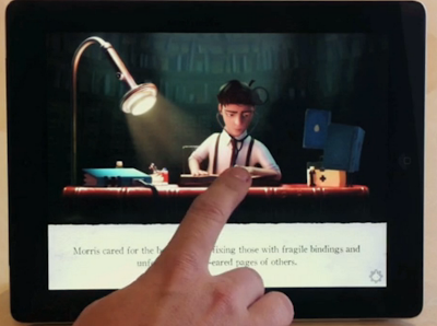
An Ex-Pixar Designer Creates Astounding Kids’ Book On iPad

"The Fantastic Flying Books of Mr. Morris Lessmore" is like a well-written bedtime story and an immersive animated movie at once.

E-books are already a fraught subject for many readers, writers, publishers and designers, but children's e-books are even more so. Is it rotting their minds? Is it as good as good ol' paper? Is it too interactive for their own good? Obviously there are no practical answers to such questions, but at least one children's e-book/app/thingie (what do we call these things, again?) is doing it very, very right. It's called "The Fantastic Flying Books of Mr. Morris Lessmore," and it's like a well-written bedtime story and an immersive animated movie at once -- without being "too much" of either.

Every page has some delightful, hidden feature embedded into it.
Part of why the book works so well is its top-shelf creative pedigree: author William Joyce is also an accomplished illustrator and animator who's published New Yorker covers, won a bunch of Emmys, created character designs for some of Pixar's first animated classics, and worked on many others for Dreamworks and Disney. With his cohorts at Moonbot Studios, he created an interactive book-app around the story and a standalone animated film--so you can experience "The Fantastic Flying Books of Mr. Morris Lessmore" however you like.

Designing interactive interfaces for kids is no mean feat, and the Moonbot team really made some great choices with "Morris Lessmore." When you open up the app, it doesn't waste your time with teaching-screens about how to interact with it--it just smoothly enters the story. (A key feature, I imagine, when you want to get Junior to go the youknowwhat to sleep ASAP.) Gently animated cues surface in the lush visuals at just the right time, encouraging you to explore the app rather than slavishly plod through it: When a house gets picked up in a tornado, you can use your fingers to swipe and spin it around--but you don't have to.

In fact, the interface design is so subtle it wasn't until I was about six pages in that I realized that every page of the app has some delightful feature embedded into it that you have to find for yourself. This is the key to a successful children's book--inviting them to play and explore and be curious, not just jab buttons to activate cheesy visual effects. And mercifully, every gewgaw in the book has a button so you can toggle it on or off: For example, you can kill the voiceover so you can read to your kid in your own voice the way God intended, or silence the music and sound effects if you want to. But they're all just a tap away if you change your mind--and the whole experience is so well-produced, you very well just might. 


Author: Lauren Davis

Webcomic The Wormworld Saga traps a daydreamer on the wrong side of the looking glass

Jonas hasn't had the easiest eighth grade year. He just lost his mother in a house fire. His father won't tell him which high school he'll be going to. And he spends most of his time doodling and daydreaming when he should be doing schoolwork. But his talent for imagination may come in handy when he finds himself on a journey through a magic mirror.

Daniel Lieske's The Wormworld Saga is a gorgeously illustrated illustrated webcomic that drifts dreamily down the infinite canvas. We start on Jonas' last day of school, where he's the only kid who doesn't know where he's going to high school. When he asks his well-meaning but uptight father, he just gets an earful about his poor grades. Jonas is a disappointment to his father on a number of fronts — not only is he more a doodler than a student, but he's also had an intense fear of fire ever since his mother died. When a fireplace throws him into panic attacks, his father demands strength rather than offering sympathy.

But for Jonas, none of that matters because he's in his favorite place in the world: his grandmother's house in the country. At grandma's, there is a cat and dog to be his companion, a forest to act out his private adventures in, and an attic to serve as his secret hideout. Something more lurks in grandma's house, though, and when something magic touches a mirror in the attic, it opens up a door to another world. And it's only a matter of time before Jonas leaps through.

So far, there have been two long and lovely installments of Wormworld, with another one due in April. I'm looking forward to the background details and bright colors Lieske is sure to pack in future chapters, but I'm most excited about the development of little Jonas. Yes, Jonas' father could stand to loosen up a bit, but Jonas, for his wooden sword and his tales of daring-do, will need to become a bit more responsible and a great deal braver.


http://www.kickstarter.com/projects/78728598/the-last-sleeper-episode-1

Interactive Cinematic Story
 The Last Sleeper is an audio-visual experience that seamlessly blends audio-books, 2D animation, comics, and adventure games into one groundbreaking interactive story.  


What is the Last Sleeper?
The Last Sleeper is an interactive story.  It's like a game, but every element is focused on YOUR experience of the story.  We want it to be a fluid experience that leads you on an emotional ride.  

What is the gameplay?
The Last Sleeper presents the story for you to play through.  Adam does a lot of exploration of this alien world, so you move him across the screen with multitouch controls.
As Adam discovers his connection to the Light of Ephos, you discover it as well.  The core of the game centers around what you DO once you have the energy - whether it is healing Fera, building a bridge out of trees, creating a shield of Light for the villagers...
It's all made from the ground up to take advantage of the multitouch interface on the iPad.

Are there cinematics?
 No.  Everything is interactive.  It's made to be a cinematic experience that reacts around you - from the music of Steve Jablonsky, the sound design of Ethan and Erik, and the wonderful art.  It's driven by YOU.

Toy Story Read Along
http://itunes.apple.com/us/app/toy-story-read-along/id364376920?mt=8


 Alice for the iPad
http://itunes.apple.com/us/app/alice-for-the-ipad/id354537426?mt=8

Week 3 - Class notes

http://fancybox.net/


Concept Statement
2-3 Sentences

Target Audience
Tailoring your site specifically to that user's needs.
          Psychographics

Goals & Needs (3-5 of each)
     Needs - come from the user
     Goals - come from the client/creator


You can avoid Feature Creep if these areas of the project are defined.


* the research pdf is due week 5
         

Thursday, July 19, 2012

Light Up Cereal Box

Homework  article:
http://www.digitaltrends.com/international/a-glimpse-into-the-future-light-up-cereal-boxes-that-report-nutrition-and-soup-that-heats-itself/


 My Commentary                                                                                        
As mentioned in the article, this cereal box is similar to the one in the movie Minority Report. The part that scares me about this is how much work is going into something that is going to be thrown away. What impact will this have for landfills? I wonder if more wholesome organic cereal will shy away from material like this in order to portray a more natural product.

In terms of interaction design I really like the idea that you could know if the item was in your pantry or not by checking your phone. Although I'm not big fan of having to open an app to check something like that. I remember about 20 years ago this one grocery store near my house experimented with having lcd screen on the fronts of the shopping carts. As you walked past certain aisle you could get coupons or advertisements.

If the box was in my trash (which happens to be next the shelf where I keep my cereal) would the app still say I have cereal left?


Week 2 - Class Discussion

----------
 Giving Feedback on websites as you click around and explore.


(On Netflix)
Every object tells a story - Ford
We don't try to design for the target audience but we try and design for the extremes. If you meet the needs of the extremes then you get everyone else in between.

Maslow Hieracrhy of Needs

The advertiser use this chart is the more higher up on the chart the company can convince the buyer that their product fulfill the more buyers want it. So for example they try and convince you that the cereal is not just fulfilling you physical needs but it is safe and healthy. Sugary cereals are more fun.


------------------
Homework 1 article - write about it. Midterm - All the research. An abstract of several articles then paste in front the page with the actual article 50 page of research including snapshots of articles.


http://origin.denverpost.com/lifestyles/ci_11420400 


Tuesday, July 17, 2012

Week 1 - Homework

Fun Product Experience

contact lense case
I'm not sure if functionally this contact lense case is any better than a regular plain case but it is fun to use.

Week 1 - Class Discussion

Don Norman - 3 ways good design makes you happy

Who is an Interaction Design (according to Alan Cooper)

Fun Theory